10 BEST LOGOS OF ALL TIME
Logos are visual manifestations of brand identity. Ideally, they communicate the soul, spirit, and overall ethos of a brand through a graphic symbol, word, or combination of both. Logos are a significant part of branding, and are the touchstones of brand recognition. Some are changed as time progresses; others become globally recognised icons that can be iterated in many different ways and still remain identifiable.
From food to footwear and computers to government services, the following 10 logos certainly translate as some of the most distinguished of all time.
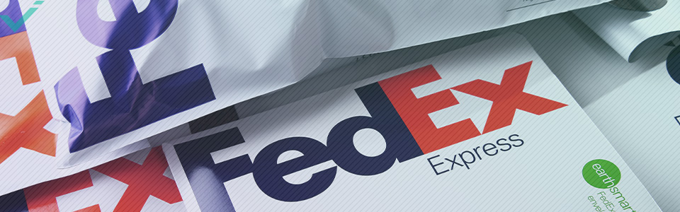
FEDEX
Redesigned from the original 1971 logo in 1994, the FedEx logo is instantly recognisable with its purple and orange lettering and clever use of negative space. Even the name “FedEx” has come to be a generic term for getting mail and parcels from one point to another, no matter which company is used.
Obvious to some, yet subliminal to others, the cheeky arrow nestled between the “E” and the “X” maximises the effect of the all white background. Why white? Planes are white, so the colour was translated onto the packaging and trucks. It’s easier to produce white packaging than to paint over 300 planes to match a logo!
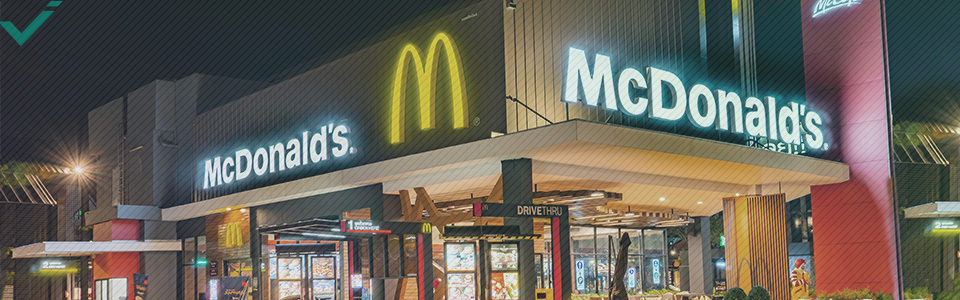
MCDONALDS
The golden arches are a symbolic representation of the early McDonald’s buildings designed by architect Stanley Clark Metson. The arches were incorporated into the buildings themselves and were later adopted as the franchise’s logo in 1968. There have been a number of iterations of the famous logo, with the most recent revamp occurring in 2003—but it always remains one of the most identifiable logos in the world.
NIKE
The Nike “Swoosh” logo was designed by Portland State University student Carolyn Davidson in 1971. It has become not only one of the most formidable footwear logos, but one of the most recognised logos in the entire world. It was designed from a simple brief proposed by founder Phil Knight, who wanted an uncomplicated design that would convey motion and be completely different to the main competitor Adidas.
It took Davidson a mere 17.5 hours of brainstorming and sketching to arrive at the final design, for which she was paid $35; although a decade later, the importance of her brainchild was recognised by the company and she was gifted Nike stock. The simple design consists of two curved lines with associated onomatopoeia, and is a representation of one of the wings of the Greek goddess Nike. It also represents a tick, which is an affirmative sigil in many countries of the world, denoting “correct”, “finished”, “success”, and “yes”.

APPLE
Supplanting the original logo of Isaac Newton under the fabled apple tree, the Apple computer’s logo with the bite mark first appeared in 1976 and has gone through a number of iterations since. The dominant apple shape with bite persists from the original. Rainbow-striped until 1998, it briefly became the translucent version and then the monochrome version until 2000. It then transitioned to the aqua-coloured version until 2007, then to the current chrome version.
Apple computers was entangled in a trademark war with Apple Music (the famous Beatles label) for 28 years until it gained all rights, for which it paid a whopping $500 million. The bite in the side is to reinforce that the fruit depicted is an apple, which retains its shape when bitten, and not another type of fruit like a peach or nectarine, which collapse once bitten.

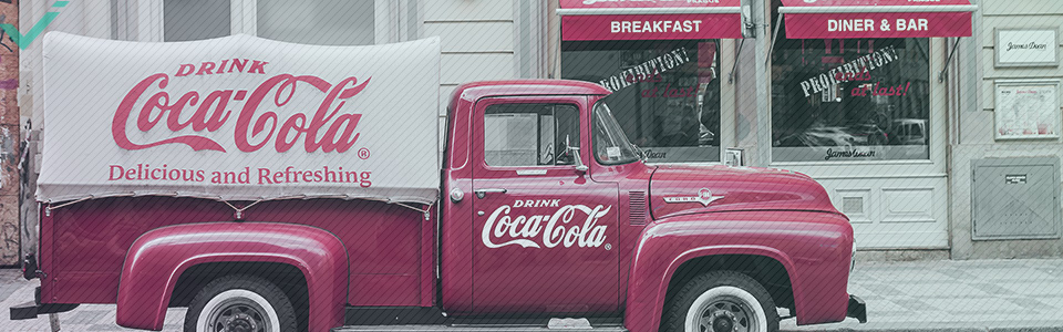
COCA-COLA
Certainly the most recognised soft drink logo in the world, the Coca-Cola font was a version of Spencerian cursive, a pedantic handwriting script of the day. Frank Robinson, a close and trusted friend of John Pemberton, the original inventor of Coke, did the original script and also suggested the name Coca-Cola, believing the two capital Cs would look commanding in advertising. The script, although tweaked over the decades, remains relatively unchanged.
A red disc was the primary graphic format from 1947–60s and became the cornerstone for outdoor signage. 1958 saw the introduction of the Arciform or fishtail background used in copy, signage, and advertising. Then in 1969, the red Arden Square background incorporating the now iconic white “dynamic wave” was introduced. The waveform is so recognisable that it can and has been used with great success without any typeface at all.
THE LONDON UNDERGROUND
One of Britain’s most recognisable graphic images is the red and blue circle and crossbar design for the London Underground. The first example appeared in 1919, and its marriage of form, abstraction, and typography was not intended to symbolise anything in particular.
Undergoing a series of minor changes over the decades, the graphic as we know it today appeared in 1954. It has since become a globally recognised transport logo and a pop culture icon in its own right, appropriated since by nightclubs, fashion houses, and the “Occupy London” movement.
As a streamlined impression of the original winged bar and disc insignia of the London General Omnibus, the red circle and blue crossbar design went on to become a universal graphic metonym for Transport for London’s family of corporate logos—with a corporate design standards manual to ensure correct colours and typography throughout.

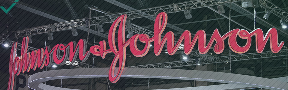
JOHNSON & JOHNSON
The Johnson & Johnson logo remains one of the most identifiable logos in the world. The original logo was inspired by James Woods Johnson’s handwritten signature and has remained unchanged for over 100 years. Continuing to be one of the most popular brands in the medical, baby care, and personal hygiene markets, they might not get many points for creativity, but their reputation and fame precludes the need for a rebranding or modernisation of this perennial logo.
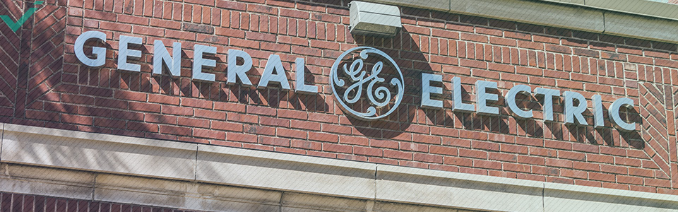
GENERAL ELECTRIC
General Electric was one of the first companies to use negative space in their branding. The curly style of the “G” and “E” are elegant, straightforward, and easily recollected. The brand has used the logo since 1892, and it has remained relatively unchanged since its inception.
A few minor tweaks to the emblem have been made over the years to suit certain applications. The computer version is slightly different to the jet engine one, but the overall aesthetic is retained across the complete product range.
AUTOMOBILES
There isn’t one particular car maker’s logo that is more recognisable than another’s. But there are several that are more recognisable than the rest. A few are iconic and have been around for over 100 years, while others are rebrands of automotive emblems that have global popularity.
- Mercedes Benz: Iconic to say the least, the Mercedes Benz three-pointed star is a symbol of motorisation by land, sea, and air. Many a rapper has hung a diamond-encrusted Mercedes symbol on a fat gold chain from their neck.
- Ferrari: Similarly, the prancing horse on a yellow background is a symbol for high-quality engineering and wealth. In fact, Ferrari branded merchandise generates as much income as the sale of cars worldwide.
- VW: The simple and elegant design of the stacked VW Volkswagen logo has remained unchanged since its inception in 1937. Contemporary modifications include the addition of 3D elements and colour changes, but the initials within the wheel are completely preserved.
- Toyota: The three interconnected ellipses of the Toyota logo were introduced in 1989. The brand progressed from its inception as an affordable, minimalist transport company to offering contemporary, well-respected cars in all classes. The emblem is automatically recognised everywhere, and it even cryptically spells out Toyota.
- Rolls Royce: The silver lady and the RR logo are synonymous with luxury. One of the oldest car manufacturers still in operation, Rolls Royce is a symbol of opulence all over the world.

SOCIAL MEDIA
With the domination of the internet, where clicking requires easily identifiable and unique graphics, logos have become ubiquitous. Think of the row of logos identifying social media platforms to which every webpage subscribes, including sponsors, affiliates, payment platforms and advertisers. Logos are everywhere.
There is no one logo in social media that is the “most” recognisable. The platforms themselves have varying degrees of popularity across broad demographics, but each logo itself is identifiable by all demographics. These logos have greater global reach than any traditional brand logo developed prior to the age of the internet. And this fully reinforces how crucial good graphic design is when it comes to the all important logo. Just think of Instagram’s play on the Polaroid, Twitter’s blue bird, and Facebook’s formidable lower case “f”.
Simple, streamlined, subliminal—these are terms that apply to many, if not most, of the logos above. Condensing an intricate brand identity into one graphic may seem overwhelming, but the simplicity of a logo helps consumers “cut through the fat” of a company to get to the essential ethos of the brand.