It’s a common fact that many designers depend a lot on colour. They use it to convey different messages, to draw attention to various details, and even to create a specific impression or atmosphere. However, while colour is indeed a major aspect of design, it isn’t always effective. In fact, for every 100 users that see your design, up to 8 of them could see it differently from you. Why? Because they are colour blind.
WHAT IS COLOUR BLINDNESS?
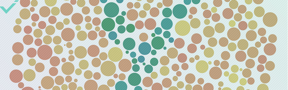
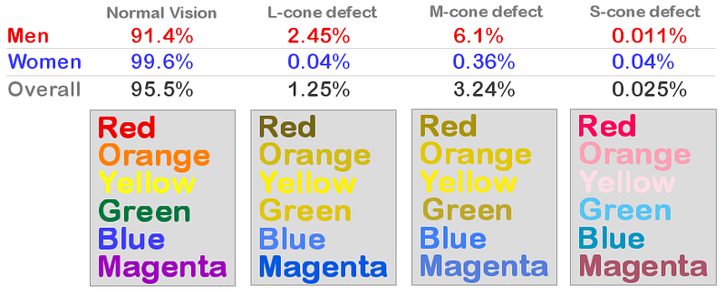
Colour blindness or colour deficiency is a mutation in the X-chromosome that leads to an inability to distinguish between certain colours. According to the NHS Choices website, most individuals with the condition struggle to differentiate between various shades of yellow, green, and red. At the same time, they might also see these shades differently. The image below demonstrates how the rainbow spectrum of colours looks to people with different types of colour blindness.
Source: iristech.co
Colour blindness affects both men (1 in 12) and women (1 in 200) worldwide. This means that at least a certain percentage of your target audience doesn’t see colours in the same way you do.
WHY YOU SHOULD CARE ABOUT COLOUR BLINDNESS
The percentage of people with this condition is relatively small, but that doesn’t mean it’s okay to ignore them. While colour blindness might not seem like a serious obstacle to perceiving a certain design, it actually is. In fact, this condition can make certain parts of daily life extremely difficult. Let’s take the below tube map as an example. The left image shows how people without colour deficiencies see it, while the right one demonstrates how it looks to colour blind individuals. The whole concept of colour-coded tube lines simply doesn’t work here.

Source: TFL
This is not the only instance where colour blindness can lead to serious hurdles. One of the most widespread examples is red markers that indicate something was performed incorrectly online. At the same time, there is usually no indicator for colour blind people (a symbol, a bold font or frame, etc.) to tell them something went awry. Take a look at this Facebook form. It uses an exclamation mark to denote something was done wrong, and therefore works effectively for this audience.

Source: Usabilla
Good design focusses on delivering specific messages to a target audience in a cohesive and successful format. Both of these things are impossible to achieve completely if you don’t take a small yet important part of your audience into consideration. In order to make a design successful, you need to ensure that it works well for your entire population, including the ones with colour blindness or deficiency. Here’s how you can do so.

HOW TO DESIGN FOR COLOUR BLIND PEOPLE
1: USE FEWER COLOURS
In many cases, you don’t need to use an abundance of colours in your design. Often times in this arena, less is more. Furthermore, minimalism is experiencing a sustained tenure en vogue. Minimalist designs using few colours or simply black and white remain perennially fresh and modern. Of course, concerning your colour blind target audience, this type of design is particularly helpful, and could even contribute to a lasting consumer relationship.
2: USE SYMBOLS
If using fewer colours in your design is not an option, consider adding some symbols to help colour blind people distinguish important components. Remember that Facebook example from above? That is one of many ways to signal to colour blind individuals that something is important. Another great example is the one below. This is yet another instance where colour blindness can actually impact one’s life significantly. If traffic lights contained symbols in addition to colours, it would be much easier for this portion of the population to understand them.
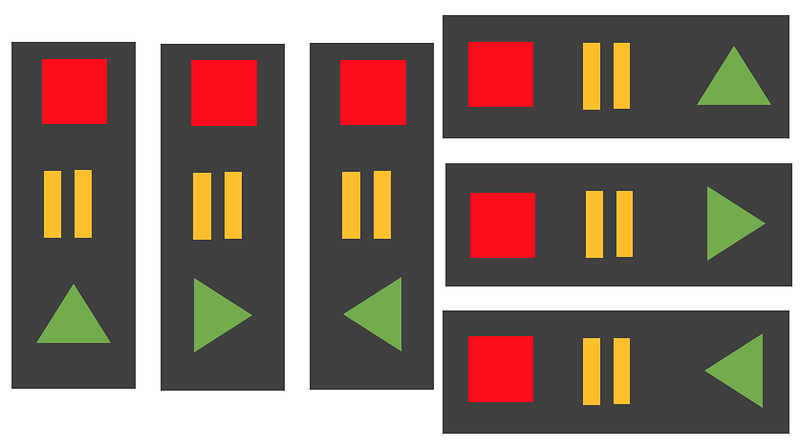
Source: uxdesign.cc
3: USE PATTERNS AND TEXTURES
In some cases (for example, when designing infographics or creating charts) you need to use a lot of similar elements. Using colour to help distinguish each element from one another is the most common approach—but for colour blind people, this might not be enough to understand the message. To make this easier, try adding some patterns to help differentiate, or even use text.
One of the most challenging tasks for designers is to create designs that work well for their entire target audience. By keeping the above tips in mind and doing your best to make your designs accessible to colour blind people, you will automatically be taking a huge step toward a more effective and inclusive design strategy. For more tips related to design and content, follow the Yuqo blog and check out our professional bespoke services.