The average social media user scrolls through the digital equivalent of the Empire State Building every single day. That’s thousands of posts, updates, memes, and ads flashing past in seconds. So, how do you make your content stand out? The answer lies in your visuals.
In a sea of content, eye-catching social media images are what stop the scroll. Whether you’re a marketer, content creator, or small business owner, knowing how to design striking social media images is no longer optional. Strong visual content can drastically boost engagement, click-throughs, and brand recognition.
This article is your practical guide to social media graphics design. We’ll cover key design principles, platform-specific optimisation, the best tools, and strategies to make your visuals work harder. From colour psychology to text overlays and responsive layout tips, this is a complete resource for creating engaging visuals for social media posts.
Why Visuals Matter on Social Media
Social platforms are increasingly visual-first. Posts with images get up to 650% higher engagement than text-only content. Visuals don’t just complement a message; they often are the message. On platforms like Instagram, TikTok, and Pinterest, visuals really are your only chance to make an impression.
Furthermore, the brain processes images 60,000 times faster than words. This gives visual assets a distinct advantage in a crowded timeline. A well-designed image can quickly communicate mood, urgency, tone, and branding.
Good visuals help with branding too. Consistent colours, fonts, and design elements build recognition. The psychology behind images also plays a role: bold colours grab attention, symmetry calms, and white space signals quality.

What Should You Include on Social Media Graphics?
A good social media image combines design with clarity. Here’s what typically works:
- A clear visual focal point (product, face, logo)
- High contrast and bold colours
- Concise, readable text
- Branding (logo, brand colours, tone)
- Calls to action (if appropriate)
- Clean layout with room to breathe
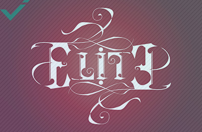
![]() Effective visuals combine clarity, boldness, and branding to help you communicate, persuade, and convert more effectively.
Effective visuals combine clarity, boldness, and branding to help you communicate, persuade, and convert more effectively.
Design Principles for Eye-Catching Social Media Images
Great visuals start with solid design fundamentals. You don’t need to be a trained designer, but understanding a few core ideas will take your images to the next level. The following are essential social media image design tips for non-designers and pros alike. Mastering these basics not only improves visual quality but also strengthens brand messaging and consistency across platforms.
Balance and Composition
Balance is what makes a visual feel right. Use the rule of thirds to guide layout: divide your image into a 3×3 grid, and place key elements along those lines or intersections. This creates a natural flow.
White space (empty space) is just as important as content. Don’t cram everything in. Let each part of your design breathe. A clean layout draws the eye to what matters most. This principle is especially important when creating visuals for social media, where attention spans are short.
Visual hierarchy helps people scan quickly. Make the most important element the biggest or boldest. Use contrast, size, or placement to show what should be seen first.
Typography and Text Overlays
Text needs to complement the image, not clutter it. Stick to two font families max. Pair a bold headline font with a clean, readable body font. Sans-serifs often work best for small screens.
Use contrast to your advantage: light text on dark backgrounds or vice versa. Always check readability, especially on mobile.
Limit text. Keep it short and sharp. Social media is about quick impressions, not dense paragraphs. If you’re wondering how to add text to social media images effectively, focus on clarity, emphasis, and alignment.
Colour Psychology
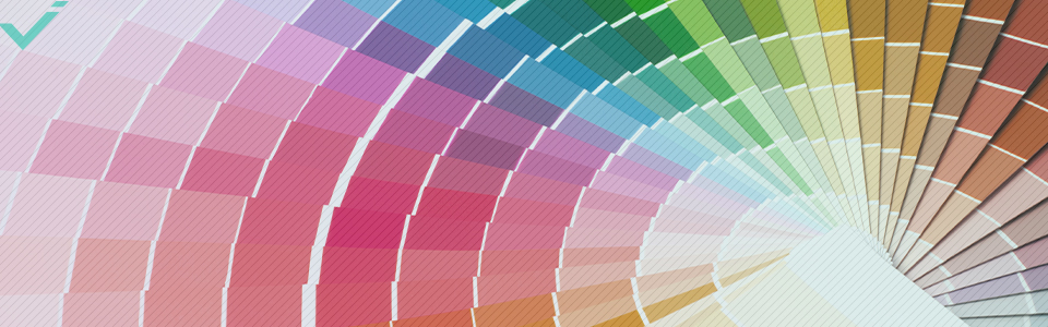 Different colours typically generate distinct emotional reactions. Red creates urgency, blue builds trust, and yellow grabs attention. Think about what you want your viewer to feel.
While it’s important to stay on-brand with your colour choices, feel free to adjust shades slightly for different platforms or moods. Understanding how to use colour in social media images can help evoke the right emotions and reinforce brand identity.
Finally, check for readability. High contrast is key, especially for text overlays. Avoid neon-on-neon or clashing tones.
![]() Balance, white space, font pairing, and colour choice all work together to create high-performing images.
Balance, white space, font pairing, and colour choice all work together to create high-performing images.
Best Tools for Designing Social Media Graphics
Don’t worry, you don’t need expensive software or years of experience to design effective, eye-catching social media graphics. Here’s a look at the best tools based on cost, features, and accessibility.
Free vs Paid Tools
For beginners, free tools like Canva and Adobe Express are a great start. They offer templates, drag-and-drop functionality, and built-in stock photos. These platforms are especially useful for those without a background in design.
Paid versions unlock extras like brand kits, more templates, and premium images. Snappa is another good choice, especially for marketing graphics. If you’re serious about social media graphics design, investing in premium features can save time and elevate quality.
Social Media Templates
Templates speed things up. Canva and Snappa offer thousands designed for specific platforms like Instagram, Facebook, and LinkedIn.
- Pros: Fast, consistent, beginner-friendly
- Cons: Can look generic if not customised
Free Stock Photos
Sites like Unsplash and Pexels offer high-quality, royalty-free images that you can plug directly into your designs.
- Pros: Professional look without cost
- Cons: Popular photos are overused, so you may see them elsewhere
Infographics
Infographics are powerful for sharing data or step-by-step content. Tools like Venngage or Canva make this easier. You can also use ChatGPT to draft ideas or outlines, but learning how to prompt is crucial for best results.
- Pros: Engaging, shareable, informative
- Cons: Take time to design well
Photo Editor/Enhancer
Tools like Adobe Lightroom or Pixlr can enhance brightness, sharpness, and tone. These elements are essential if you’re optimising image sizes for different social media platforms.
- Pros: Improves image quality, especially for product shots
- Cons: Slight learning curve for beginners
![]() The best tools for designing social media images depend on your needs. Use templates, photo editing, and infographics to add power to your visuals and create eye-catching content with ease.
The best tools for designing social media images depend on your needs. Use templates, photo editing, and infographics to add power to your visuals and create eye-catching content with ease.
Platform-Specific Image Optimisation
Designing for social media means tailoring your images to the specific platform. Each one has its own specs, strengths, and audience habits. Optimising image sizes for different social media platforms helps you look professional and keeps your message clear. It also ensures that no critical content gets cropped or distorted.
Instagram, Facebook, LinkedIn, Twitter/X
- Instagram: Square (1080×1080) or portrait (1080×1350) works best. Great for high-impact photos, short text overlays, and stories. If you’re wondering how to make Instagram photos stand out, focus on bold colours and minimal text.
- Facebook: Use 1200×630 for shared images. Facebook scales aggressively, so centre your key content. Text and calls to action should be placed away from edges to avoid cropping.
- LinkedIn: Ideal size is 1200×627. Keep text minimal and professional. This platform leans corporate, so clean layouts and conservative palettes tend to perform better.
- Twitter/X: Go for 1600×900. Bold, simple visuals work best. Avoid tiny details or long text as these get lost in the feed.
Mobile vs Desktop Considerations
Most users browse on phones. That means small screens, quick scrolls, and compressed visuals. Designing with a mobile-first mindset ensures your graphics are seen and understood.
Tips:
- Use large, readable fonts
- Test on mobile before posting
- Compress file sizes to speed up loading
- Keep layouts clean and uncluttered
Also, pay attention to how images crop in previews. What looks fine on desktop might cut off key elements on mobile. Responsive layout tips like centring the focal point and avoiding edge-heavy designs are key for cross-platform consistency.
![]() Match image sizes to each platform and prioritise mobile readability to stay sharp across screens. Optimising image sizes for different social media platforms helps your content look polished and perform better everywhere.
Match image sizes to each platform and prioritise mobile readability to stay sharp across screens. Optimising image sizes for different social media platforms helps your content look polished and perform better everywhere.
Pro Tips and Best Practices
Beyond the basics, there are a few extra tricks that can make a big difference. Following these social media image best practices allows you to create with confidence and consistency across all platforms.
Brand Consistency and Templates
Stick to your brand colours, fonts, and tone. Build templates that use your logo and layout so everything feels familiar to followers. This not only builds trust but also boosts recognition in busy feeds.
Reusing successful layouts, like a weekly quote post or product highlight, lets you save time while maintaining a cohesive look. You can adjust colours or text to suit the context without starting from scratch each time.

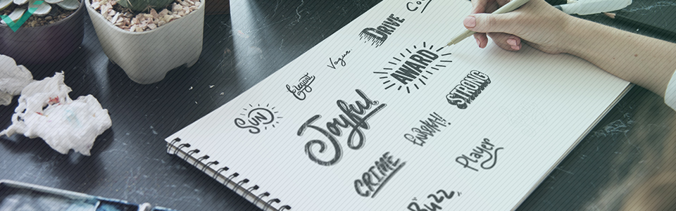
Using Illustrations and Icons
Illustrations can simplify complex ideas, explain a process, or add a unique stylistic edge to your visuals. Icons help break up text, highlight key points, and guide the eye.
Sites like Flaticon or Noun Project offer free and premium icon packs. Choose illustrations and icons that align with your brand style. Avoid mixing clashing styles. Consistency is more important than variety here.
A/B Testing Visual Performance
Don’t guess, test. Try different images, colours, or layouts for the same post and compare performance. Most platforms now offer built-in analytics to help you measure engagement.
Consider:
- Click-through rates
- Likes, shares, saves
- Comments and reach
Use this data to refine future visuals. Over time, you’ll learn what style, tone, and image types resonate best with your audience. And then you can design accordingly.
![]() Templates, icons, and A/B testing turn good design into smart, scalable performance. Use consistent visuals and test frequently to learn what works.
Templates, icons, and A/B testing turn good design into smart, scalable performance. Use consistent visuals and test frequently to learn what works.
Create Eye-Catching Social Media Graphics
It’s straightforward: design matters. Strong visuals stop the scroll, build brand trust, and drive action. This is essential if you don’t want your posts to get overlooked.
Now that you know how to design social media images that stand out, try putting one new tactic into practice today. Whether it’s testing a new colour scheme, refining your typography, or trying out a new tool, even small changes can yield better engagement.
Creating standout visuals for social media doesn’t require a design degree; you just need the right strategies and a bit of practice. Keep your audience in mind, stay consistent, and let your images do the talking.
As you continue experimenting with colour theory, layout techniques, and different design tools, you’ll naturally start to build a more professional and effective visual presence. Stick to your branding, test new approaches, and, of course, trust the process.
Whether you’re working on boosting Instagram engagement or refining your approach to typography, each post is an opportunity to grow your skills and impact. Have fun!