If you want to make your marketing strategy more efficient, you should remind your clients about the things you want them to do. Yes, even when those things seem obvious.
That’s what CTAs are for; and they do their job well. According to Ellie Mirman, VP of Marketing at Toast, emails featuring a single CTA increased clicks by 371% and sales by 1617%. But it’s not only emails that CTAs work well with. Websites and landing pages benefit from CTAs too.
So, what are CTAs exactly and why are they so effective?
WHAT IS A CTA?
A CTA (call-to-action) is a part of your message that tells the audience what to do. If the CTA is strong and well-written, it could serve as additional motivation for the audience to do what you want them to.
We’ve all seen CTAs everywhere: “Click here” and “Buy now” are the simplest and most common examples. CTAs often look so simple that their effectiveness might even surprise some people. Yet, they work very well, for psychological reasons and many others.
WHY IS A CTA EFFECTIVE?
A CTA gives the audience clear guidance, which is often needed. The audience doesn’t have to think about what to do next to achieve a particular result or to get something—a CTA tells them that already.
CTAs are also great for structuring the content on your website. The audience won’t miss an important message or an essential section of the site if it is accompanied by a visible button or outlined by negative space.
A good CTA could also keep the audience motivated. Sure, the visitors of your website might be interested in your product or service already, but it is still possible to lose the desire to buy or order something while scrolling through the site. A CTA usually pops up to draw the attention back to your product or service, and to serve as additional encouragement.
HOW TO CREATE A GOOD CTA
A good CTA is:
- Powerful: The words are chosen carefully to motivate the audience. It is impossible to misinterpret what is expected from the audience.
- Short: Usually no more than five words.
- Visible: Easy to spot on the webpage.
Let’s focus on each of these characteristics more.
1: MAKE A CTA POWERFUL
A CTA might not consist of many words, but the choice of these words still matters. The audience needs to know what to do and should be motivated to do so.
Therefore, use verbs and encourage action instead of merely offering the information. “Download the book” has a bigger impact on the audience than “Our latest book available”.
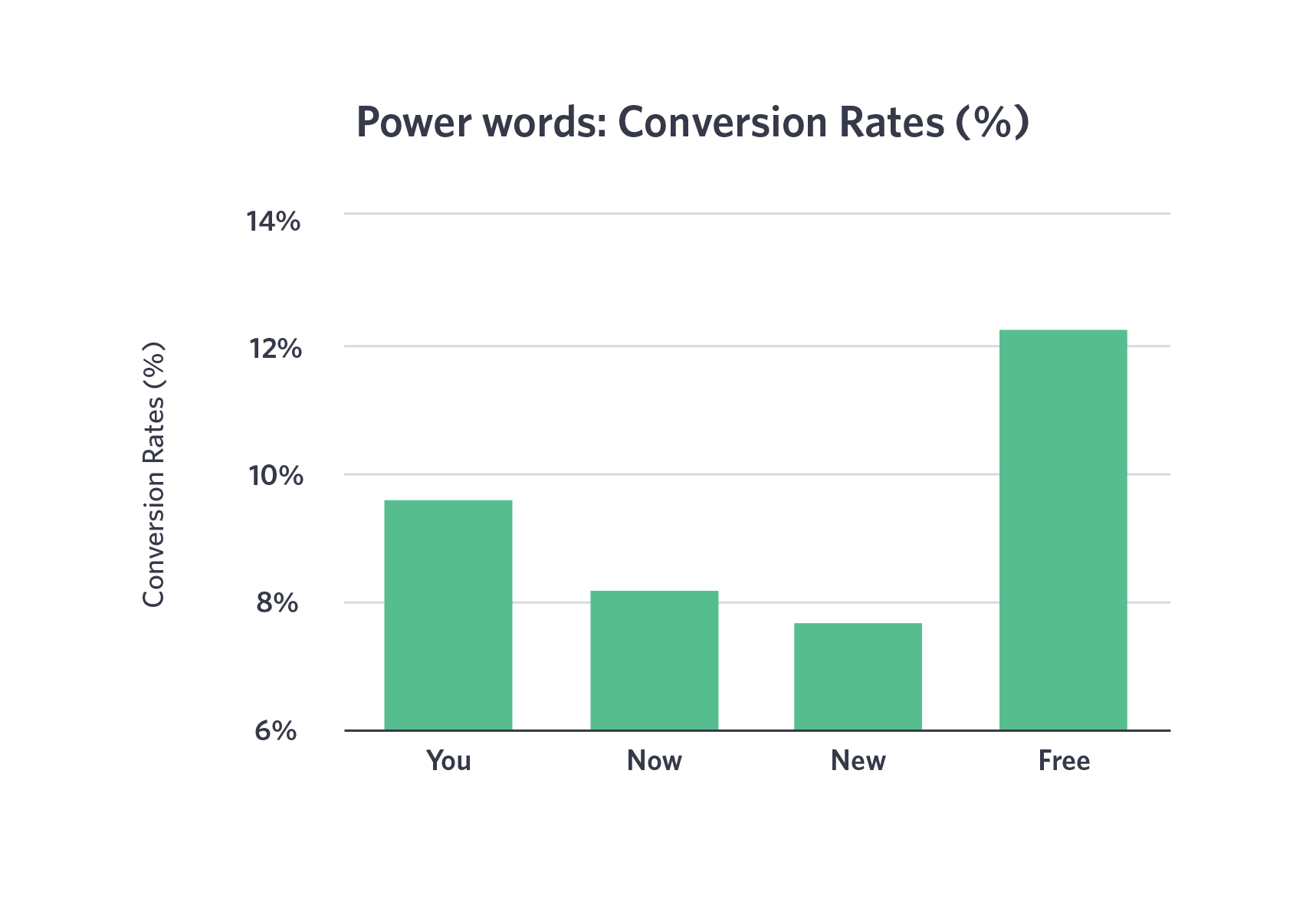
Consider using power words as well, as they could be beneficial. Keep in mind that some of them might be more effective than the others. Wistia’s 2016 guide on CTAs in video marketing demonstrates that.
Another good way to make a CTA effective is by appealing to the emotions of the audience. “Become your best self” will have more impact than “Buy our self-development course”.
2: ALWAYS WRITE CLEAR CTAS
The more CTAs, the better—or not? While having a couple of CTAs on a page could increase their efficiency, placing too many could confuse your audience, especially when they are placed one after another.
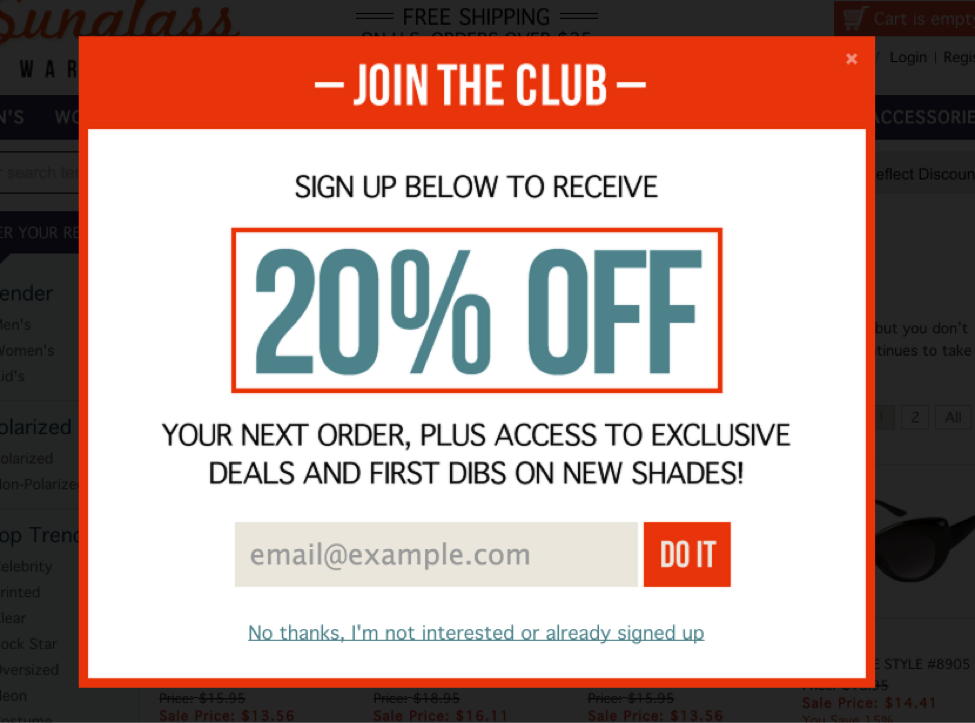
Take a look at this example of an unclear CTA provided by Wix:

Though the CTAs themselves are encouraging and straightforward, they follow one another and could confuse the audience. This is the most common example of unclear CTAs.
Sometimes, however, CTAs could be even more unclear: “Do this”, for example. The audience might also get confused depending on the text that preceded the CTA. However, when the context is clear, this won’t be an issue, as seen in the example below.
3: DON’T MAKE A CTA TOO LONG
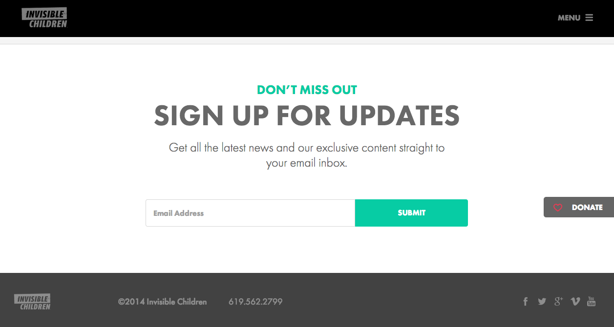
CTAs are effective because they are simple. Short, powerful phrases are easy to read and to consider before deciding whether to follow their guidance or not.
That’s why in most cases, CTAs are short: up to 10 words, but generally closer to 5. When the statement is simple, it’s easy to comprehend. The visitor doesn’t have to think much before making their decision—and that’s good, because when they think too long, there’s a chance they won’t follow the CTA in the end.
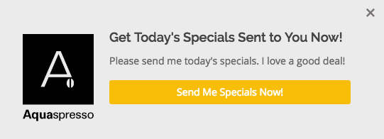
Below is an example of an efficient CTA that consists of two sentences. However, it works mostly because these sentences are short.

4: CTAS SHOULD STAND OUT
It’s what’s expected of them. As we see CTAs each day, we get used to them standing out, and therefore might miss one if it blends in with the rest of the website’s design.
No marketing specialist would want that. CTAs are created to attract attention and to ensure that the audience won’t miss anything important. So making them visible and easily spotted is crucial.
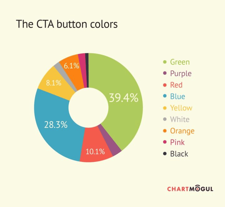
If your CTAs are buttons, you should pay attention to their colour. Here are some 2017 colour statistics that could help you.
And if you create text CTAs, make them stand out with the help of font, negative space, or formatting.
Perhaps one of the most interesting things about CTAs is that they don’t have to be original. Most effective CTAs are usually similar and commonly used: “Buy now”, “Sign up”, and so on.
Therefore, instead of aiming for creativity, aim for effectiveness when crafting CTAs for your website, and don’t forget to track statistics to check the results.